

Introduction
For those of us who strive to make a fine print the ultimate expression of our photographic art, the widely used methodology of editing in Lightroom and then clicking on “Print” simply does not work.
There are many reasons for this.
The subject of how to make a fine print is quite complicated and impossible to fully cover in a single essay, but I hope that the information contained in this article will give the reader a better understanding of the printing process and become a good starting point for those who have a strong desire to improve their prints.
Why Is Printing So Complicated?
For starters, as good as Lightroom is, it still lacks a lot of the more sophisticated and more refined tools available in Photoshop. I find that I can bring an image to a much higher level of quality using Photoshop.
The second issue is the fact that an image that looks perfect on the screen will not print well.
The image at the top of this article, “Zion Panorama” is a classic example of an image that prints completely different from the way it looks on the screen. In fact, printing the file “as is”, results in a terrible print.
Looking at a print on paper implies that light strikes the paper and the eye is looking at light that is reflected off the paper base and the ink droplets that were deposited on the paper (While I will only refer to paper in the rest of this article, the same applies to canvas and other printing materials).
Paper bases vary quite a bit and they are never perfectly white. This automatically affects the color we perceive in a way that a reference image on a display has not been affected.
Papers also vary significantly in terms of sharpness, maximum black and maximum white rendition (D Max and D Min) as well as many other characteristics.
Therefore, even with perfect color management, the contrast, blacks, whites, colors, sharpness, color gamut, dynamic range and saturation in the print will be different from the image viewed on a display which is an emissive device.
And speaking of computer displays, the image depends on the type of computer display and whether it is properly profiled and calibrated. We will explore this in a little more depth later in the article.
To make matters even more complicated, the human eye/brain combination is masterful at compensating for different lighting conditions. Displays are usually calibrated at D 65 (Daylight, 6,500 degrees Kelvin). The eye/brain perceives a white tone on the display as “pure white”. It perceives all the other the colors so they look right with the background light on the display at this color temperature. When the eye/brain sees a print, it also compensates to perceive the paper base as pure white, but as we know, the base is not pure white. In fact, the base is almost always more yellow than the white in a D 65 calibrated display. However, the original colors in the file were set to display properly on a D 65 “base”. Therefore the colors will appear wrong in the print because the base is a different color. The photographer needs to compensate for this disparity before making a print.
Further issues that can affect print quality include color management, paper characteristics, paper profiles, printer options and configurations, ink types, printer calibration and so on.
Making a fine print requires not just the right equipment. It requires masterful image editing, the proper way to run the printer, the proper choice of materials, and more importantly: Significant skill, knowledge, dedication and patience.
The moment you see a fine print, you know that the results are well worth the effort. There is a very big difference between a fine print and a print that is made by simply clicking on “Print”.
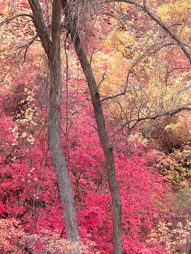
Trees, Sinawava. Zion, UT
Displays
I absolutely cringe when I see someone editing an image using a laptop computer. A recent anecdote will illustrate this point:
I received an email a few weeks ago from a very dedicated amateur photographer who shoots Medium Format as well as 35 mm. He owns some very fine cameras and lenses. I had mentioned to him that I am very disappointed with the color rendition of a number of the latest cameras on the market (I do not know the cause, the only common thread I can find is that all these cameras use sensors from the same supplier).
He responded by sending me an email in which he claimed that I was in error and that a simple color cast correction solved the problem. He proudly attached some files shot with one of these cameras and he claimed that the colors were “as good as it gets” in these images. One of the images was supposed to have a perfectly neutral background.
When I opened this image and looked at it on my display, the background had an ugly green cast and there were all kinds of color anomalies elsewhere in the image. I pointed this out to him. He responded that he was very surprised, since it all looked perfect on his laptop (which happens to be a top of the line, latest model).
I suggested he look at his images on a different display. A few minutes later I received another email from him telling me that he had opened the same image and looked at it on his 27 inch display and he could now see the ugly green cast and some of the other anomalies (he could not see all the other anomalies because his display is not as good as the display I use for photography). He was stunned by the difference. I was not at all surprised.
There are many things that will show up on a good display and definitely on a print that one cannot see in a laptop display. To make matters worse, most people who use laptops for editing do not seem to even bother to try to profile or calibrate their displays for photography. It is no wonder that the world is awash with bad images!
It is also not surprising that the most common complaint heard from amateurs is that their prints “come out” too dark. No, their prints do not “come out” too dark all by themselves, the problem is that their displays are too bright so they compensate by making the images darker.
So here is my advice to those that edit their images on a laptop: Don’t!
Most computer displays are not designed to be used for fine art photography. In general, as delivered from the factory, the vast majority of displays are too bright, too blue, too contrasty and have an unacceptably small color gamut and unacceptable variations across the screen. Many displays cannot be calibrated for proper brightness and contrast without a severe loss of quality because they are not designed to operate in that brightness range.
For those of us interested in quality, having a really good display is indispensable. Remember, the display is the reference device where we view, edit and evaluate our images. Therefore, it has a huge influence on the file that produces either images on other people’s screens or the final print.
Not only is a high quality display indispensable, I also find it imperative to be very meticulous in terms of making sure that the display is properly profiled and carefully calibrated at all times. A lot of grief, wasted time and wasted materials can be eliminated with a properly profiled and calibrated high quality display.
It is important to note that even the best commercially available displays still have a color gamut that is much smaller than the color gamut of most printer/paper combinations. Even the finest displays can barely match the Adobe RGB color space in terms of color gamut. Yet the color gamut of a standard Epson printer designed for photography (or any other high quality printer) vastly exceed the Adobe RGB color space.
(Note: In case you are wondering, most cameras also vastly exceed the Adobe RGB color space when shooting in RAW mode. This is one more reason not to shoot in JPEG mode if you are interested in quality and it is also one more reason to not use Adobe RGB as the working space. Pro Photo RGB is a much better choice for the working space when shooting RAW).
Current displays usually have only about 1/5th of the resolution of a good printer (this will change with the introduction and adoption of 4K graphics grade displays in the next few years, but even with 4K, the resolution of current printers is still quite a bit higher and is likely to increase in the future).
I make the last two points about displays to drive home the point that evaluating an image on a display can only give a rough approximation of how a final print might look, since the display cannot match the resolution or the color gamut of the printer.
“Soft Proofing” (explained below) and the development by the photographer of a “sixth sense” on how a displayed image will look as a print are key in order to create a fine print in an efficient manner.
In the end, only a series of test prints can lead to final success. I usually make a “first final” print and put it in a print viewing station with calibrated lights. The print viewing station is in my office so I see the print repeatedly as I come and go. After a few days I invariably find things that can be improved.
One of the great joys of digital photography is that one can start exactly where one left off and go from there. So I start where I left off, I make some changes to the image and print a “second final print”. I repeat the process until I am happy with the quality and the feel of the print.
It is a good thing that my office is a high traffic area, because every now and then my wife, my son or a photographer friend will make a comment or point out a potential improvement in what I thought was the final print and this leads to an even better print.
It is only after a few weeks that I feel confident that prints of the image using the very final recipe (the “real final print”) will qualify as fine prints and elicit a strong reaction from the viewer.
Software
Because I care about quality, I am keen to use the best software for RAW conversion and the best editing tools I can find. As a result, I typically end up using 3 or 4 different kinds of software to edit each image.
For example, when I am working with a PhaseOne digital back, I use CaptureOne for basic global adjustments and for RAW to TIFF conversion.
I then use Lightroom for rough editing and finally Photoshop for fine editing to create a master file, as well as to re-edit and prepare an image for printing (more on this later). I also use a few plug-ins or separate software packages such as Photokit Sharpener 2 as required.
Soft Proofing
I have never quite understood why Soft Proofing seems to be such a mystery. For reasons I cannot understand, it seems that hardly anyone knows what it is and there is a tremendous amount of confusion when it is explained in a lecture or at a workshop. I am always amazed at how few people use it before they make a print.
The concept of Soft Proofing is quite simple and extremely useful.
In everything that follows, I will talk about Photoshop using an Apple computer, but obviously all the concepts apply regardless of what software you use (as long as it allows Soft Proofing) and whether you use an Apple or a Windows machine.
Let’s assume that you spend a lot of time editing a beautiful image until it looks gorgeous on your display. Let’s call this your “Master Image”.
As we mentioned above, if you open the image in Lightroom or Photoshop, select all the correct color management options, select your preferred paper and paper profile for this image and click on print, the print will look very different from the Master Image on the display.
Each image is different, but in most cases, you can expect the print to have a significant difference in sharpness, lower global contrast, lower saturation, muddy shadows, “chalky” highlights, overly cool colors, a different tonality range and several other differences.
The question is: What if you could simulate on the screen what a print from that file would look like, without actually having to make a physical print?
This simulation on the screen is called “Soft Proofing” because the software is displaying a proof print for you on the screen.
By now you know the answer: Photoshop allows you to see a simulated print of the Master File as it would look if printed on a specific paper. This can save lots of time, ink and paper (meaning money savings too) and it also helps tremendously in terms of arriving at a fine print more effectively.
I will show you my step by step procedure of how I use Soft Proofing, but before we plunge into the details, let’s understand the process:
The first thing I do is duplicate the Master Image. I also rename the duplicate adding “print” and the type and brand of paper to the original name.
I then open two images side by side in Photoshop:
1. The original Master Image
2. The duplicate with soft proofing turned on for the duplicate. It is crucial to have Soft Proofing turned on for this duplicate. It is also very important to have the two images displayed at the same magnification at all times.
With the images side by side, I make adjustments to the duplicate such that the newly adjusted duplicate (with Soft Proofing turned on!) looks as close as possible to the Master Image.
Besides having a visual match, one can also use Photoshop’s eyedropper measuring tools to make sure that brightness levels and colors in important areas measure the same in the two images, thus assuring a close match.
At this point, the adjusted duplicate becomes what I call the “Master Print File”.
A physical print from the Master Print File will begin to approach the best that the specific paper can deliver in terms of matching the original Master File on the screen.
As long as the print is displayed under the same lighting conditions for which the paper profile was calculated, and as long as one is not using a specialty paper with unusual characteristics,
this print will look quite close to the original Master Image on the display.
There are more adjustments that still need to be made to achieve a fine print, but the critical first step is to get close to the look of the Master Image.
I hope the reader can appreciate how powerful and useful Soft Proofing is. It provides a clear path to come close to the look of the Master Image with tremendous savings in terms of time, effort and materials.
I would never make a print of any image without using Soft Proofing first!
I urge the reader to understand this section well before proceeding further with this article.
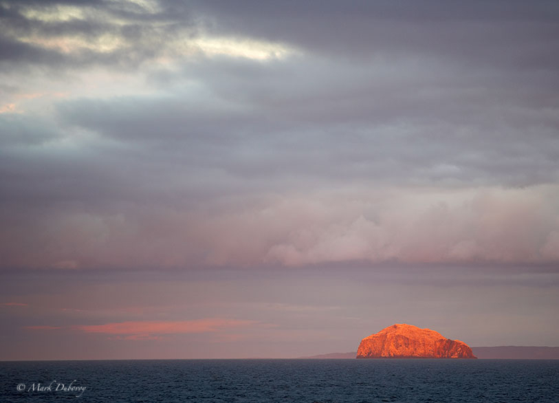
The-Rock,-East-Anglia, UK
Step by Step Instructions
My step by step instructions are relatively simple and straightforward:
1. Open your Master Image in Photoshop.
2. Open the duplicate image in Photoshop. Make sure this image is selected before you proceed with the next step.
3. In the top toolbar click on View>Proof Setup>Custom:
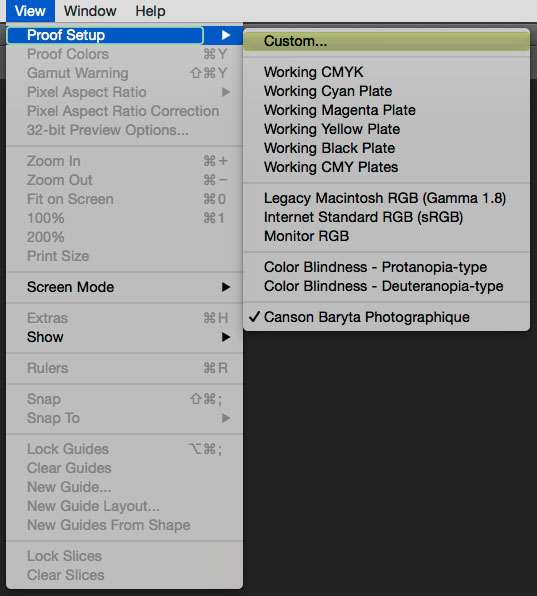
SoftProof dropdown menu
Custom Menu
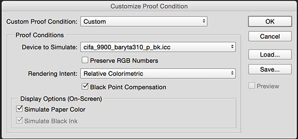
4. In the Device to Simulate field, select the profile of the printing paper you intend to use. If for any reason this profile is not shown, make sure you have the profile stored in the correct folder in your computer (Library>ColorSync>Profiles).
5. Under Rendering Intent I usually pick Relative Colorimetric because this is also my most used printer setting, but in some instances you may want to use Perceptual.
6. Do not check the box for Preserve RGB Numbers.
7. Check the boxes for Black Point Compensation and Simulate Paper Color.
9. You can save this Proof Setup to recall it in the future or you can simply click OK.
10. Your duplicate image will now show a simulation of what the print will look like. You can toggle back and forth between showing the simulation and not showing it by pressing simultaneously the Command and the Y keys.
11. To position your Master Image and the duplicate side by side, go to Window>Arrange>2-up Vertical. Your Master Image and the duplicate (again, make sure Soft Proofing is turned on for the duplicate) are now in two side by side windows. The Window>Arrange drop down menu also allows you to match zoom and match location of the two images.
As mentioned above, at this point you are ready to start adjusting your duplicate image so that it closely matches the Master Image.
The first global adjustments I make almost all the time are a series of curves adjustments to match the contrast, followed by saturation adjustments to better match the original. I then make adjustments to the tonality of the Soft Proof to match the colors of the simulated print to the Master File as best as can be done on a display. Because I make these adjustments manually, I like to work in Relative Colorimetric mode throughout the process.
Some people prefer to work in Perceptual mode where the software determines some of the adjustments, but I do not like to lose control and I find that manual adjustments pay off with higher quality in the end.
There are many other required adjustments beyond the ones mentioned above, but they are image dependent, so I cannot give you any more specifics. You just have to figure out where the differences are and what to do to try to eliminate them.
But Wait, There’s More…
Sorry, but even after doing all this all this, you are still not ready to make an optimum print.
First, the obvious: You need to make sure that whatever printer you are using is in tip top shape, warmed up, clean nozzles, head alignment checked, maximum quality settings, inks that have not expired, ink cartridges that are shaken at least once a month, etc.
But this is not enough.
In most commercial products, manufacturers try to strike a balance between cost, ease of use and quality. They also need to cater to a wide variety of users. They cannot focus on one small segment only. When your personal criteria is quality above all, factory settings and factory recommendations are often inadequate.
My favorite example of this is the fact that Kodak used to rate Tri-X film at ISO 400; but Ansel Adams discovered that each batch was different and the Kodak ISO rating was too high to capture good shadow detail.
Most of the time Tri-X worked best at an ISO of around 240. Had Ansel not tested each batch of film, and had Ansel just followed the ISO 400 Kodak recommendation, he would have never obtained the exquisite shadow detail his prints are so famous for.
And speaking of Ansel’s prints, had he followed the standard recommendations for washing and fixing, his prints would most likely be faded, yellow stained and brittle by now. Again, he completely changed the factory recommendations to include a different fixing methodology, Selenium toning, hypo clearing and much longer wash times. Thanks to his changing the factory instructions, his prints survive in beautiful shape today.
In terms of inkjet printing, I found years ago that pumping more ink into the paper by increasing the ink density in the Epson printer settings gave me much better results versus using the standard settings. The colors were better, the saturation was better, the D Max improved and at least theoretically the prints should last longer because there is more ink present.
The exact amount of extra ink is paper dependent (for my papers it was in the range of +5 to +15). More importantly, the added ink density required me to re-profile all my papers. The very fact that the printer includes an ink density slider tells us something…
(Unbeknownst to me at the time, Bill Atkinson who is one of the top engineers in the country, a superb printer and a world authority in color management was doing the same thing with ink densities for his prints, as I found out later).
I also found that the standard profiles provided by manufacturers were a bit of a crapshoot. Some were OK, some were not so good, none of the ones I tried were great. My own custom profiles were always quite a bit better. Besides, all the manufacturer’s profiles were useless once I started changing the ink delivery settings.
While I have not tested each and every profile provided by each and every manufacturer for every product made, I am definitely not going to bet the quality of my prints on any of these profiles and I am not going to bet the quality of my prints on only standard printer settings either.
As a result of this, I ended up purchasing a decent spectrophotometer with an automated target reader, profiling software and all that. I had many thousands of dollars invested in devices and software and I also ended up spending a lot of time making profiles. This “necessary evil” was expensive and time consuming.
Because of this, I investigated using a Raster Image Processor or RIP to run my printer, but the first one I tried did not work well, so I gave up.
Some time later, a friend suggested that I give the ImagePrint RIP made by ColorByte Software a try.
ImagePrint 10
The whole point of trying a product like ImagePrint is that the product takes complete control of the printer head. The manufacturer’s driver is no longer used.
The biggest advantage of this is that if the software driving the head has been developed for maximum image quality, and if the profiles developed for the way the head is driven are really good, it is possible to achieve better image quality than using the original print driver regardless of the printer settings.
Fortunately, this is exactly what I experienced when I first tested ImagePrint. There were some prints where my own profiles and ink recipes using the Epson driver were very close and hard to distinguish from prints made using ImagePrint, but with the majority of my test images the prints using ImagePrint were clearly superior.
While ImagePrint does not appear to be an inexpensive product, for me it was an immediate bargain. It cost much less than my spectrophotometer alone, not to mention the cost of the software and the value of my time. So I sold my spectrophotometer and decided to use ImagePrint for all my prints. In my opinion, the product is fairly priced and can easily be justified by those interested in making high quality prints. For those that require sophisticated layout tools, the savings in time and materials will pay for the product in a short time.
One should not think of ImagePrint as just a RIP. It is much more than that:
Basically, ImagePrint uses its own color engine, takes over your print head, takes over the entire color management system, and takes over the profiling of your paper. This complete control of the process, combined with their focus on top quality, results in inkjet prints that in my experience cannot be bested with any other approach.
It also saves you from some of the potential glitches like the ones that have occurred in the past where the color management system is broken because Epson or Adobe or Apple or two of them or all three start to change things and they do not necessarily talk to each other.
In terms of profiles, I cannot compete with a dedicated team that has been doing it for decades, owns the best equipment there is and writes their own profiling software. The ImagePrint profiles are superb; they are as good as it gets. They have profiles for thousands of materials in their database and if you find a printing material that is not in the database, they will develop a profile and make it available to everyone else that owns the product. The profiles are also typically provided for different lighting conditions such as daylight, tungsten, fluorescent and mixed lighting.
I have been testing the beta version of ImagePrint 10 which will be released shortly. The print quality continues to improve in each new version. The two things I like best about the new version are the print quality and the new tools.
Rather than doing an extensive writeup about the details of the product, I felt it would be more useful and more efficient to include the following 17 minute video of a conversation with John Pannozo, Founder and CEO of ColorByte Software:
Sharpening
I decided to dedicate a short section to sharpening, because proper sharpening for a print is not something that can be viewed on a screen. It can only be seen on the paper.
This is where the sixth sense I mentioned above comes in. Many excellent printers have a sixth sense about how much sharpening and what kind of sharpening needs to be applied to a print. The only way to achieve this sixth sense is knowledge of how the different sharpening methods work, lots of practice and lots of experimentation. Note that the amount and type of sharpening varies with the specific paper used and with the size of the final print, so the sixth sense includes an intimate familiarity with the specific paper.
Rather than working with a large number of papers and changing all the time, it is much better to find one or two materials that match your style and taste and get to know them intimately.
There are output sharpening tools such as those in Photokit Sharpener 2 that are reasonably good in terms of getting you in the ballpark for general types of papers like “glossy” or “matte”, but in the end manual intervention is required. The new sharpening tool in ImagePrint is the best I have used so far for output sharpening. The reasons are explained in the next section.
Food for Thought
An interesting thing about printing is that the printer affects the final file. In other words, after you have produced what you believe is an optimum file and sent it to the printer, the printer will still change your file before the inks are deposited on the paper. In other words, your final file still needs to get through the print driver, and the driver will typically re-size and modify your pixels, disturbing such things as your output sharpening. This is one more reason why certain print characteristics are basically impossible to simulate in Photoshop or other editing software, and test prints become necessary.
There is something new in ImagePrint Version 10 that makes this another area where ImagePrint has an advantage: When using the new tools, such as the new output sharpening tool, the software shows you a much closer simulation of what the print is going to look like because ImagePrint knows exactly how it is controlling the printer and how it is modifying your file, and all this information is included in the simulation.
Furthermore, sharpening is done in a non-destructive way, so your original file is not modified. Your sharpening settings are saved in the ImagePrint job file for future reference. As a result, there is no longer a need to save multiple files of sharpened prints at different sizes. All you need to do is save the Master Print File (with no output sharpening).
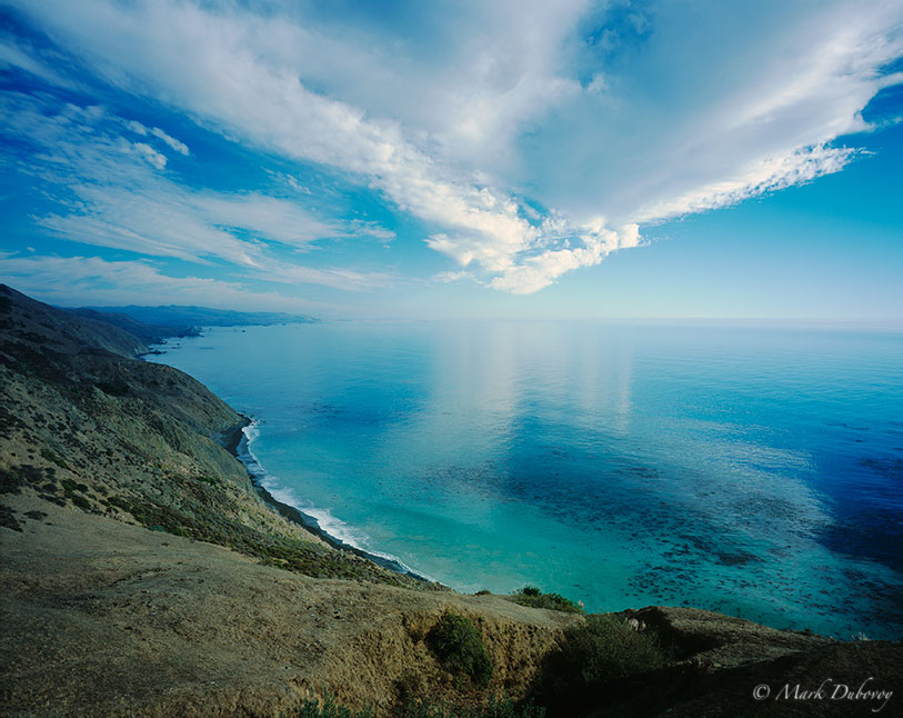
The-North-Coast, CA
Conclusion
Modern inkjet printers are amazing. Careful, skillful and patient work, combined with a really good paper profile, can yield high quality prints using the recommended print settings and factory drivers.
On the other hand, one can make better prints by modifying the recommended settings or by using a product such as ImagePrint.
The two strong recommendations I would like you to keep in mind are that regardless of how you print, you should always work with a profiled and calibrated high quality display designed for Photography and you should never make a print without adjusting a Soft Proof first.


Your Thoughts